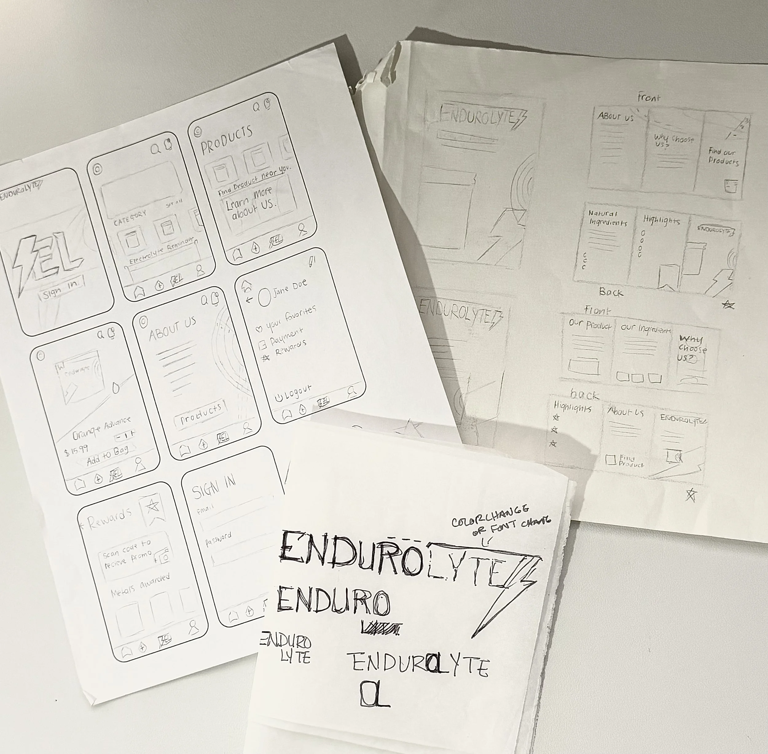
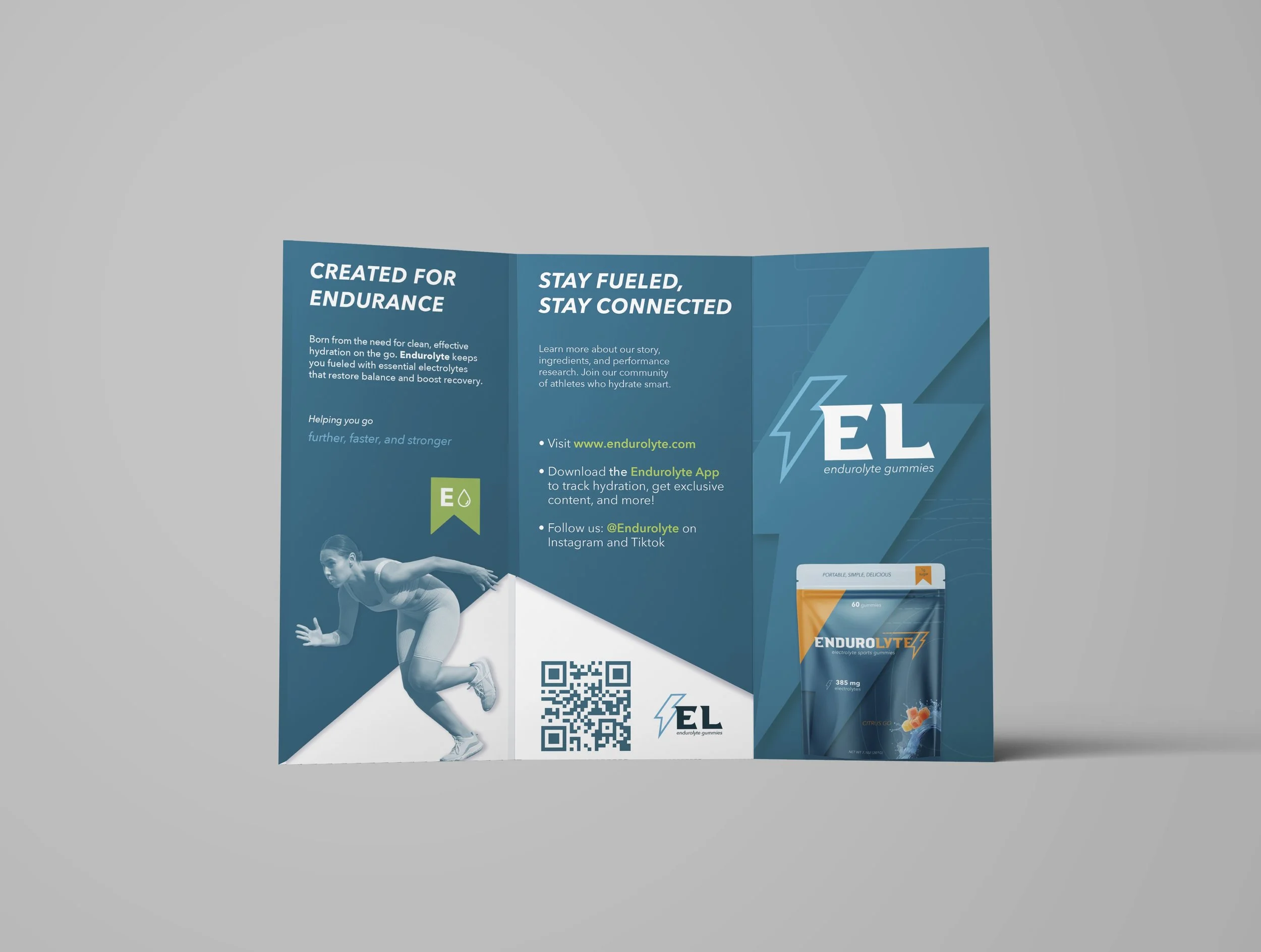
The goal of this project was to create a cohesive brand identity and promotional campaign for a new product I created: Endurolyte, an electrolyte gummy designed to make hydration simple, portable, and enjoyable to take.
THE CHALLENGE
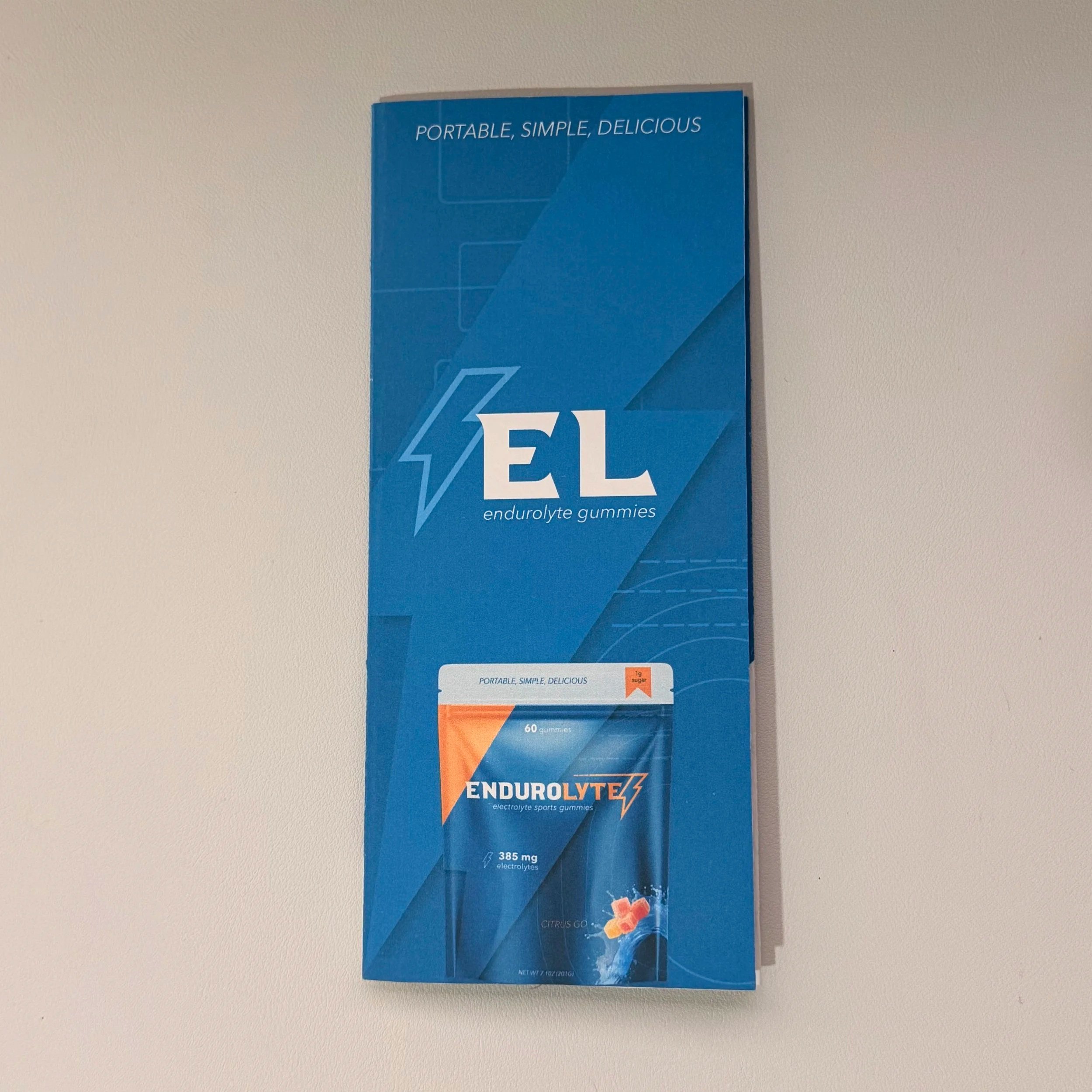
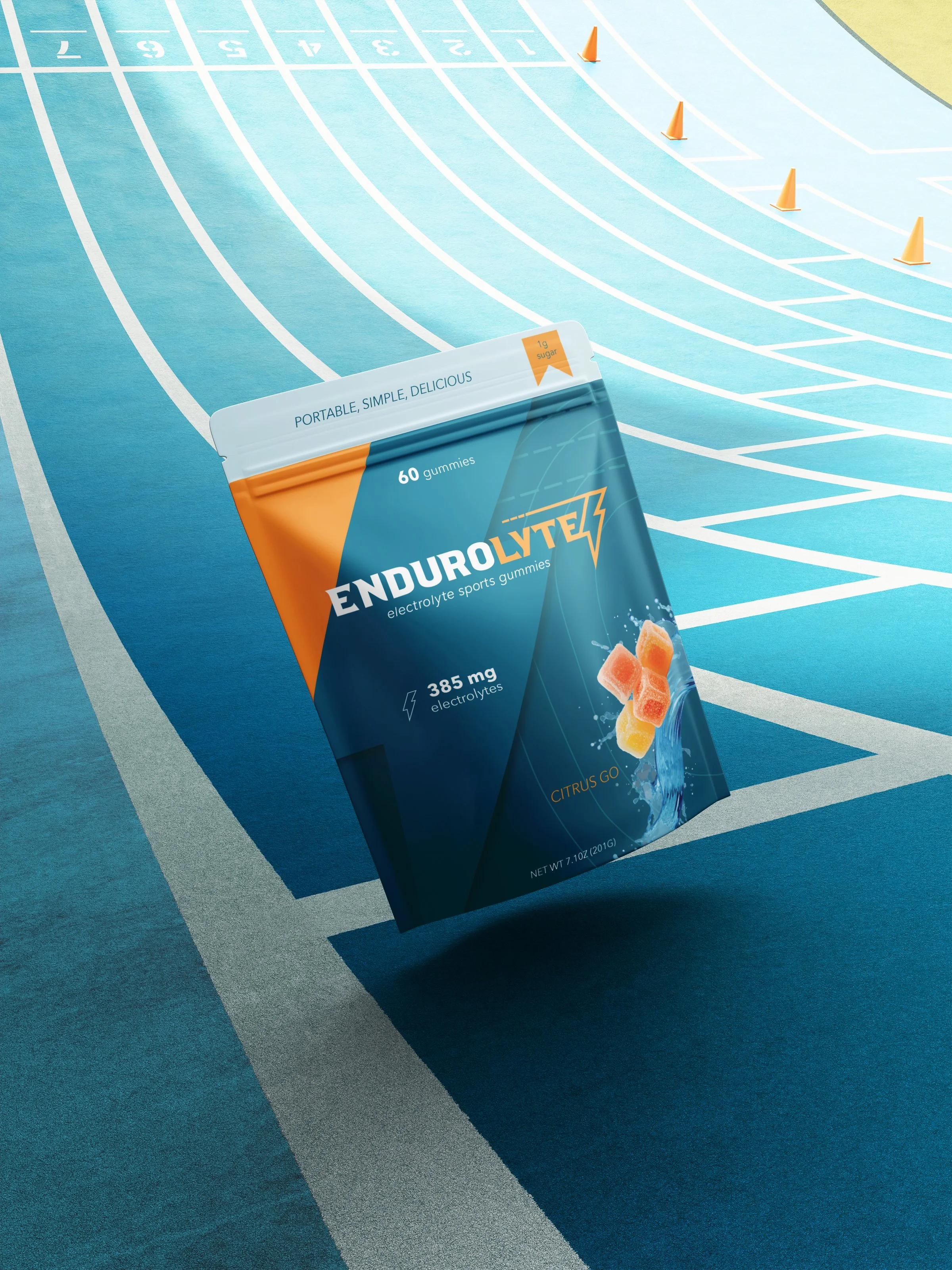
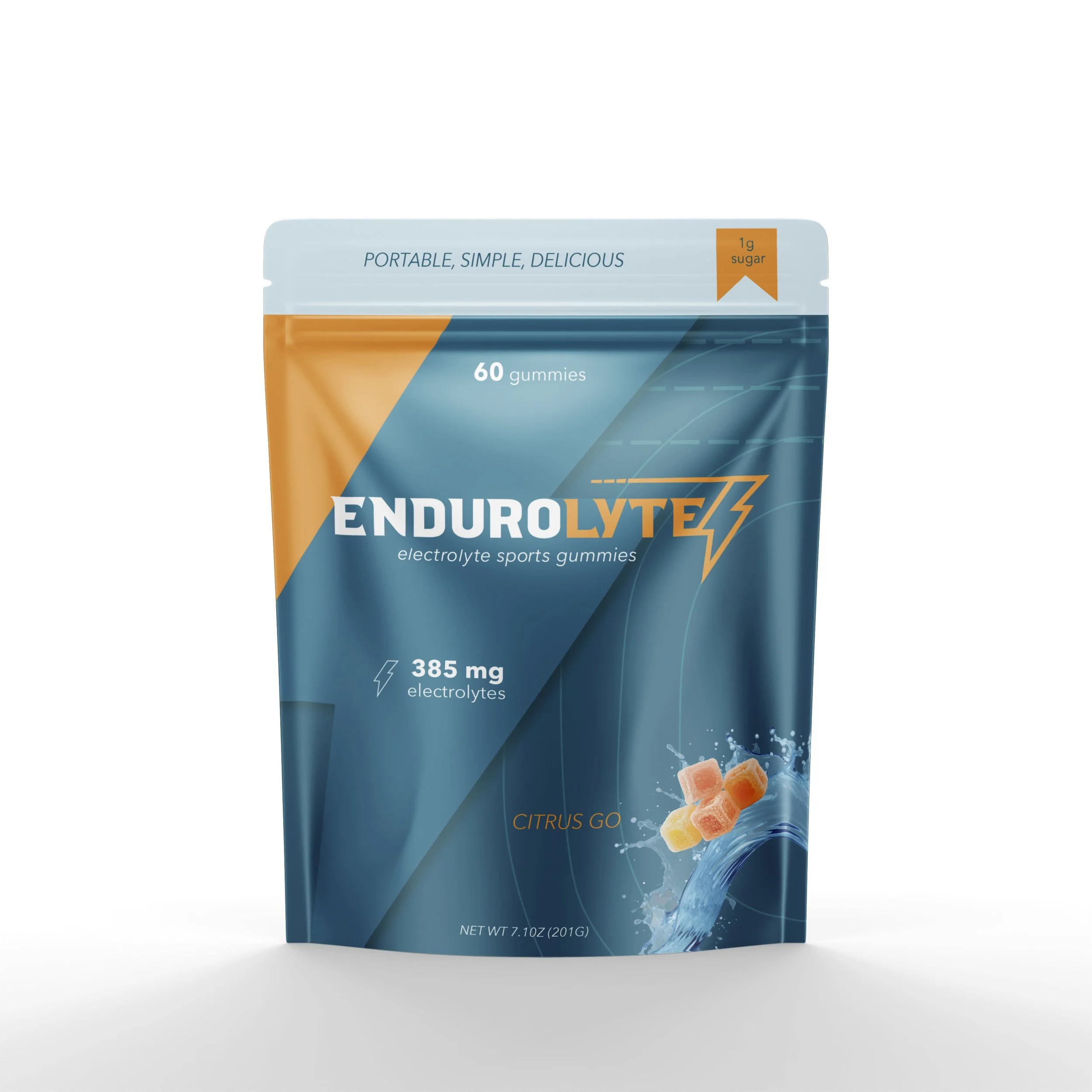
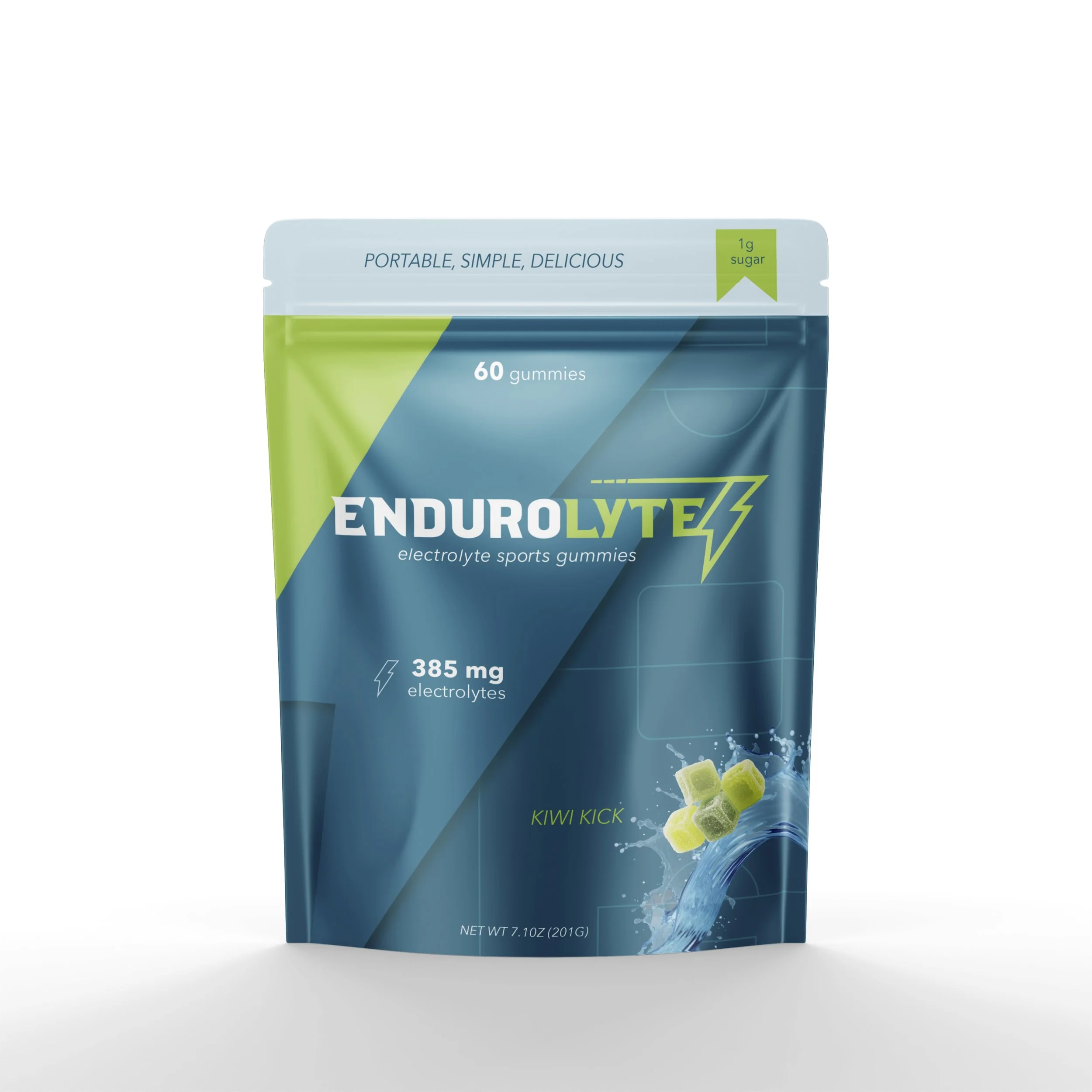
The product: an electrolyte gummy built for real life workouts, workdays, tournaments, and weekends. The design challenge was to introduce Endurolyte as more than just another “performance supplement.” It needed to feel credible to athletes, but not intimidating to casual, busy, health-conscious people. The goal: launch Endurolyte as the hydration upgrade you’ll actually remember to take. The project aimed to create a system that felt clean, trustworthy, and athletic, reflecting the brand’s tagline: Portable. Simple. Delicious.
Endurolyte Campaign
THE CONCEPT
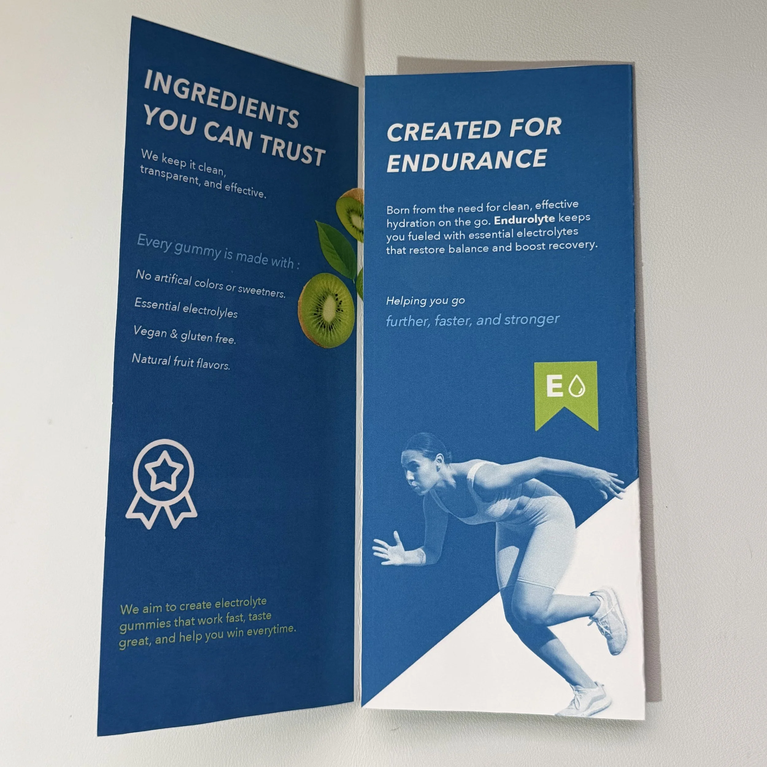
Balance credibility with playful, energetic energy to appeal to the target audience. Most hydration solutions assume you’re standing still with a shaker bottle. Endurolyte assumes you’re moving.
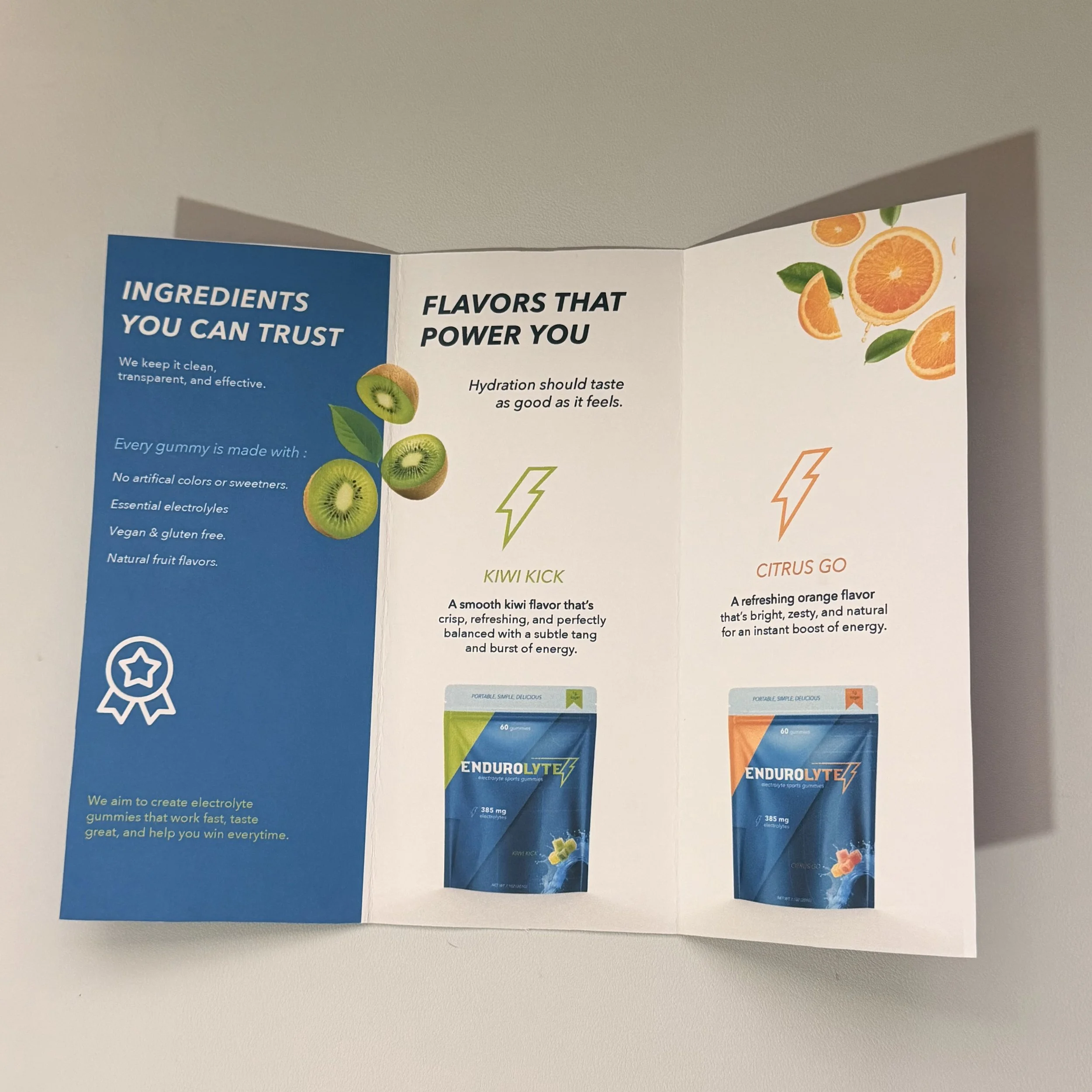
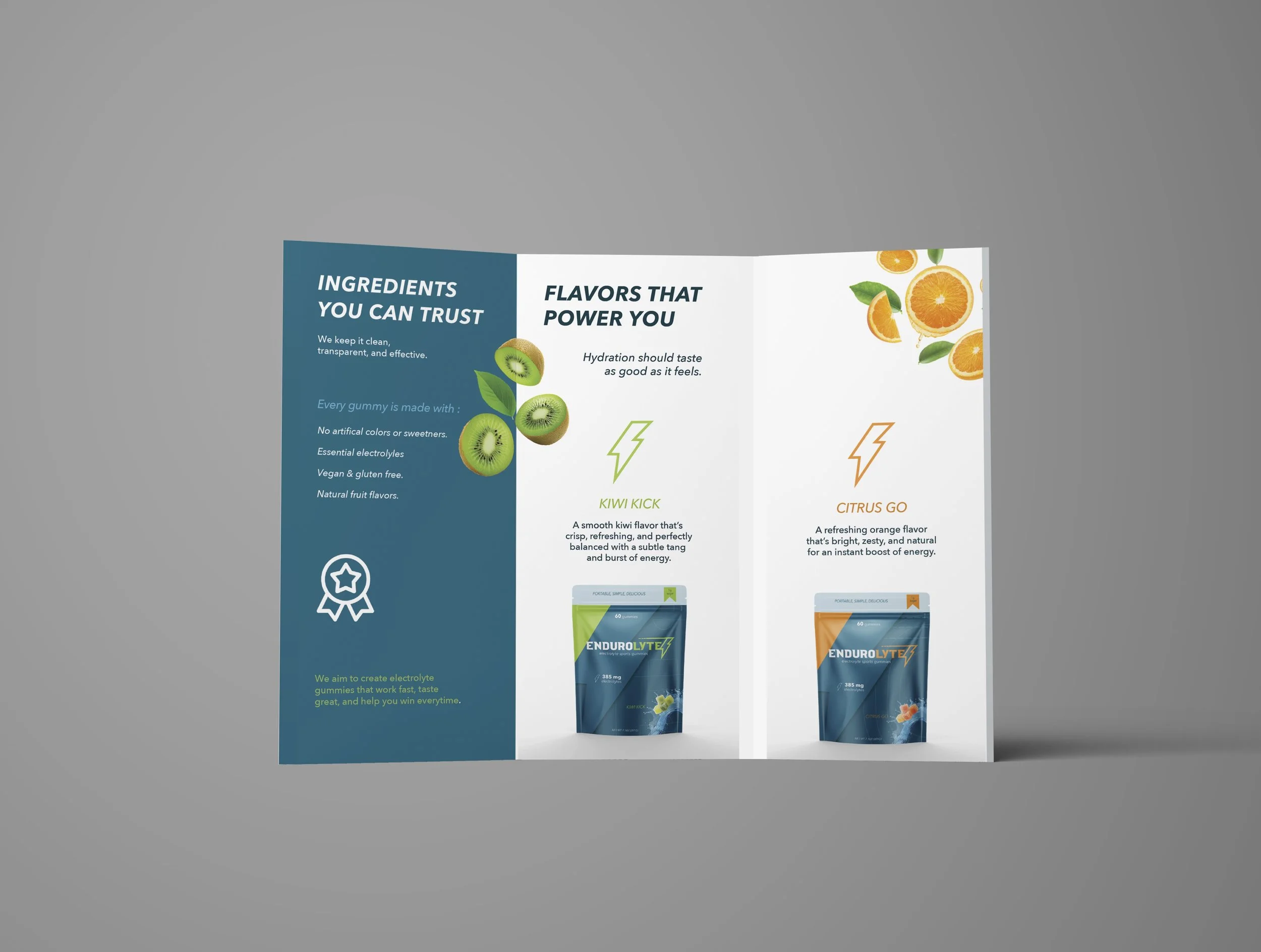
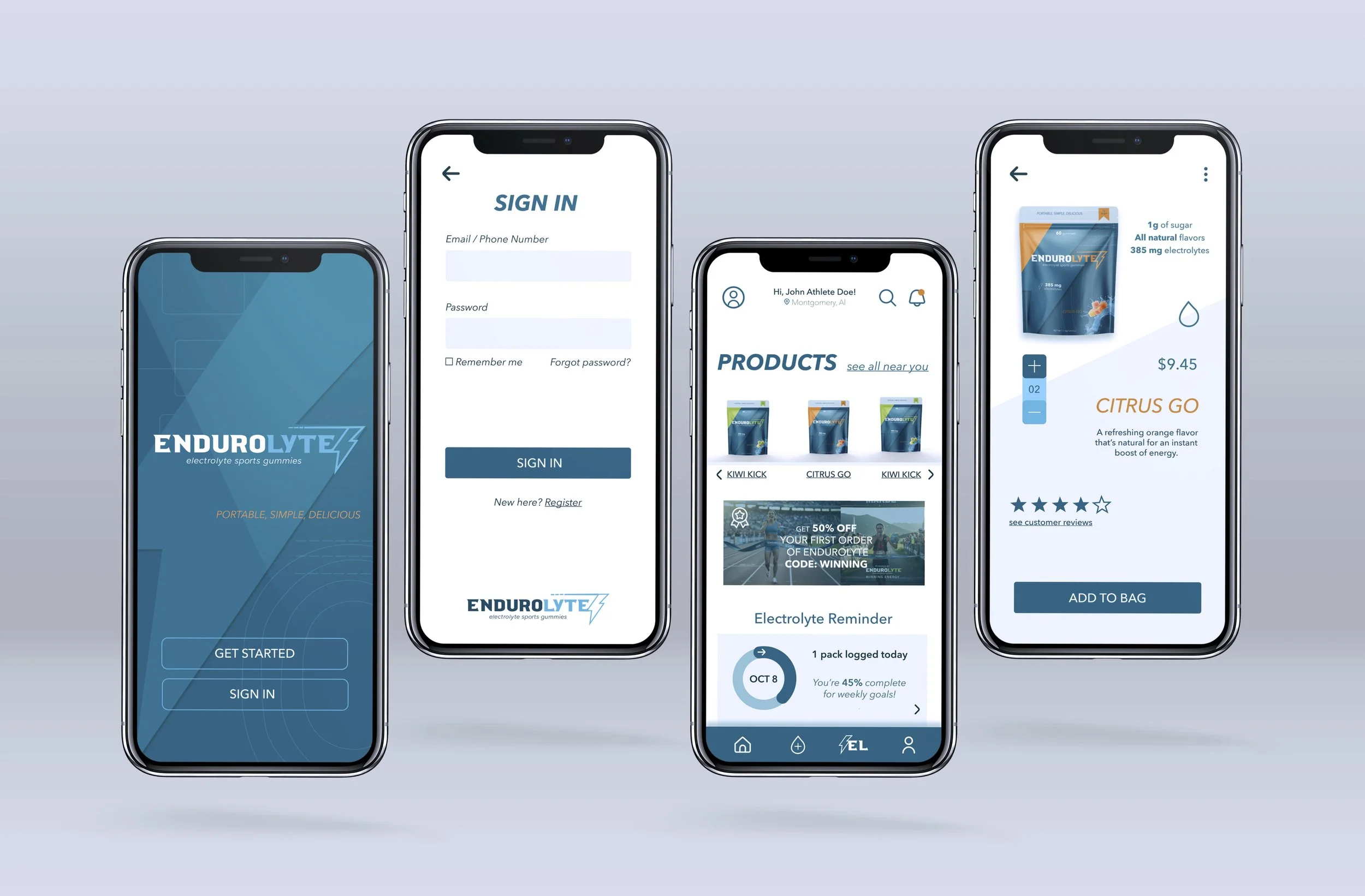
Using Adobe Illustrator and Photoshop I incorporated angled geometric lines to suggest speed and endurance, while clean typography communicates clarity and function. Each flavor has its own accent color for quick recognition. It incorporates a Bright, energizing palette: Blue = trust, hydration, freshness and Orange = energy, endurance, performance. I also paired this with my sports court illustrations to encourage brand association